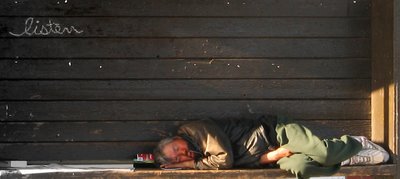
Red Light, Green Light

The problem with taking photos while driving is that you rarely have enough time to adjust your camera settings. I took this photo while at a red light. If I was carefully planning the shot I would have had a larger lens opening and a faster shutter speed. Unfortunately, I'm stuck with a slightly blurry subject, but I like the picture too much to junk it.
Besides cropping it, I made a few adjustments to this picture in order to punch up the "message". I boosted the saturation on the sleeping man, while desaturating the opposite corner. I also increased the contrast in the top left so that the word "listen" would stand out more.
I'm not 100% satisfied with this image, but unfortunately I accidentally saved over the original file, so I can't really undo the things I would like another try at. What do you think? Is it too preachy?
Canon PowerShot S2 IS, 20mm, f/8.0, 1/60 sec, ISO 50


24 Comments:
I think it's a powerful and sad image at the same time. It says a lot.
this is a sad image but well taken from the car! cheers ;)
I'm usually in the passenger seat while taking pictures from the car... and yes, they don't always turn out the way you wanted- but this look pretty neat. But at the same time it is kinda sad... I feel bad that he is sleeping there :\
Why do you think it might be too preachy? What is the 'message' you think this image is giving off? ...Just wondering...
Too bad the original is gone... I'm not the best at editing pictures- I would have liked to see the difference- or what else you could have done.
Thanks for sharing Timmy! Great post ^_^
~K
I think the word in this shot helps! It makes you think more about what your looking at! Well Done!
I agree with wolf...the word on the wall makes this photo more powerful. It was worth taking even if the focus is slightly off.
Good job.
Incidently, I've also taken some quick ones "while on the road". If you are interested, hit the "up against the wall" link on my aloha photo site.
You guys are right. If I were to give this photo a title, I would call it "Listen".
I Love taking pictures from cars!If on my blog - the picture is not from my window or walking it's from a car alright - especially taxis because they are slow buggers.Anyways - I like this shot, yes there is the contrasts between the various colours but also that 'listen' written in graffiti seems to give a purpose to the entire image.He's not listening is he :-P Great shot!
I know what you mean. I wish I had my camera this afternoon. I passed a mother with her three children, two of which were in an electric child's jeep. It looked so cute and so awesome.
I think this picture works great, and you really lucked out with that spot of sunlight on him. Nice catch from the car, and good job on the post processing.
I've done a lot of 'from the car' shots, and I know exactly what you are talking about. You did a fine job with this one, and the way it turned out, sort of fits the topic. Good'n.
Very powerful shot AS has been pointed out.
It isn't that bad. I really like the way that listen is so prominent!
Nice cropping although it's sad what it shows.
A powerful message about an all too common sight. Thanks for sharing this one.
Before reading the content of your post, I already thought its a strong image and even more when I noticed the word Listen ..Great catch ,really ! nevermind the additional touch-up :)
I also like this one, the underexposure builds atmosphere. I think if youd adjusted the camera, youd only have ended up with more processing to get back to something like this. Its very rich.
this is so strikingly different from the pics you normally take. a different kind of beauty, and definetely different with the word in it too. oh the DTES. we should go on a photo mission there some night.
you should see the pics I took with a D70 this weekend. a dream camera.
Very interesting. Good spot. The word listen adds alot to the shot.
Even though it's not perfect the crop makes for a good composition and the subject is interesting.
I like this shot, my favorite. Very well composed, and very unique in giving the message, though a bit contrasty. The guy is obviously sleeping :-) B&W could go well, and make the writing more contrasty. Cheers.
Tena koe ehoa
The image content has a very strong expression as conveyed by most who have commented, have had some sort of emotive response to this image.
Could the image be better expressed with another camera set-up?
Well I'm not sure if it would retain the same strenght as it does now if you had time to set your camera to a setting you'd think more appropriate?
I tend to agree with "pete" on this aspect.
The final crop makes the composition appealing and creates an impact of both subject matter and text.
like as being said before its a very emotive capture. nice one.
i would consider it strange if anyone is ever 100% satisfied with their work! just keep on shooting.
Yes, sad. But good photo and the composition is what makes it good.
Excellent composition. Great framing and straightforward perspective. I really like this one. Cheers, Brent
Post a Comment
<< Home