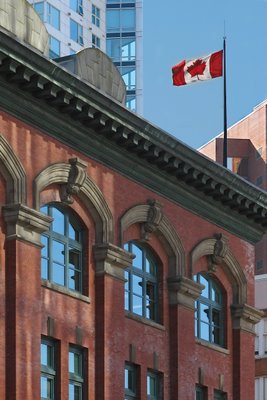
Bricks and Flag

Yesterday's photo caused quite the stir. While I respect Suby's opinion that I should always do the work required, I do have an excuse. I'm away from home all week. I'm without my precious Photoshop, so I'm stuck with what I've got, finished product or not. It's interesting that people seem interested to see the final edition of yesterday's photo. I'll work on it over the weekend and post it again next week.
Today's photo was taken when I was downtown a couple weeks ago. I don't know what this building is, or why it interested me, but it did. I think it was just refreshing to see a red brick building amongst all the steel and glass. I know it doesn't necessarilly have a wow factor, but I like this photo because of the shadows and reflections on the wall and windows. I think the flag is a nice touch too. What do you think?
Tomorrow I will be posting one of my favorites. Stay tuned...
Canon PowerShot S2 IS, 28mm, f/5.6, 1/100 sec, ISO 50


9 Comments:
I like this one Tim but I feel like I want to see more of the picture. I feel like the view may be a bit too narrow. I find myself wondering what's around the building and what it's front door looks like. Still, nice shot of a very pretty building.
Have fun meeting Benjamen! :)
A good photo causes one to wonder and imagine. I love the building the way it is. Tim, you're doing a great job. Keep it up.
Jim Cheshire
This is a lovely building with classic architecture. The combination of colors are really pleasing. Very good shot. Yes the flag is a nice touch.
I would also love to see a broader shot of the building in addition to this one, not instead of. :-)
I just typed a long comment thrice : just before I published my comp. restarted itself so i'll jeep this short because im so irritated now : lovely shot ,falg stands out + contrast GREAT GREAT SHOT!
Nice photo! Maybe it's the consulate or embassy...
I agree with Azhar: the flag really stands out. The building almost plays second fiddle to the flag. I like the way you framed the building: you were completely parallel with the vertical lines of the building; that can be tough. Nice one. Regards, Brent
Nice architecture in this building. The Canadian flag....I never get tired of seeing that flying strong and true.
well composed! looks like a mixture of the new and the old and a flag in between! cheers :)
That building does have wonderful character, and I can see why it caught your eye!
Post a Comment
<< Home