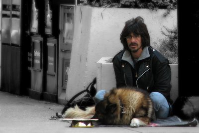
Despair

Sorry I missed yesterday. I tried to post this photo yesterday, but there was a problem with the site and I couldn't log on. Thanks for your help with Monday's photo, there were some helpful suggestions, but people seemed to like the concept.
Today's photo was taken downtown last week. I manipulated the image because I found that when in colour there was too much clutter competing for attention. I tried it in b&w, but found the same problem.
I created two versions of this photo, one with an ultra sharp background and the one you see here, with a blurred background. I think like this background because, again, it keeps the focus on the subject. Having worked on this photo for a little while, the impact of this man's face has worn off on me. I'm interested to hear your first reaction. To be perfectly honest, I found this rather heart breaking when I first saw it. Your thoughts?
Canon PowerShot S2 IS, 72mm, f/3.5, 1/80 sec, ISO 50


13 Comments:
Very, very well done. Thought provoking. Excellent visual commentary.
I don't know what to make of the man. He appears to be homeless, but is he really? Or is he mentally ill? Or both?
The reason I ask is because there is a woman in our neighborhood who is ill and she appears homeless, yet she is not. She lives with her mom only a block or so away from us. She goes shoeless, or with plastic bags on her feet. She also carries a lot of stuff in duffel bags wherever she goes. She often wears unusually worn out clothes and just wanders the neighborhood, sometimes even bathing in the river. Usually she hides from you if she sees you coming. She'll often run into the woods or into someone's yard rather than be seen. Yet I know she has a home, a very nice clean home and a mom who cares for her. She is not very young, probably just a few years younger than me. She's lived there as long as I can remember. She is in and out of the hospital fairly regularly. It's very, very, sad.
A very powerful shot : and very well post processed.GREAT GREAT SHOT!
It is quite emotional, and I think you did well in focusing the attention on your subject.
amzing shot man - did he spot you taking the shot - what did he say to you ? i want the story too if there is one
he looks like hes thinking about all his problems and they are adding to more than he can cope with -
amazing photot tim
very nice street photo, he does seem be in despair..
Nice job, Tim. I like the way you kept the subject in color and desaturated the rest of the image. Very nice.
It's a sad photo. Especially seeing his expression. Like how you desaturated the rest of the photo to keep the focus on him.
Tena koe ehoa
This is a spectaclar piece of street photography TB!
For me the dog, although not adjectively sad, creates the sad expression in this image more than the central figure of the gentleman. His nondescript stare is the element that highlights the sadness even more.
Woderfully rendered as well with a careful attention to softness of tones and subdued lighting.
Hi Micki, that is a very familiar site out here. the homeless have found it is more comfortable to starve in a warm place than cold one. Very emotional shot.
Ooops, sorry Timmy, I was thinking of someone else.
good idea to use spot colours! the b/w add on the mood of this shot :)
Now this my friend is a powerful shot, it invokes a reaction/emotion from the viewer.
I however do not like the processing done to the image. The colour seperation is cool, the blurred background is cool, but I would have sharpened the main subjects to make them stand out even more (dynamic range). What we have here is an almost flat shot.
Also you need to be extra careful with your colour seperation, you seem to have missed a spot on his left shoulder. The wall to the right of the shot adds nothing to the image (dead space) This should be cropped out, also crop everything over the wall behing him.
Why not give it a try, if it looks any better I'll smile, but if it doesn't, oh well, it was worth a try.
Suby
Very nice - I like the feeling of lonliness in it yet the dog provides a sense of hope.
Overall a powerful image I would have been prowd to have taken.
Post a Comment
<< Home