Simple can be good

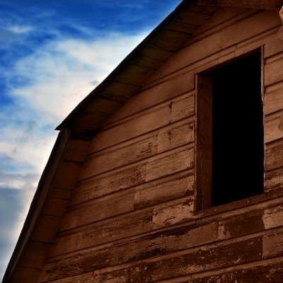
I like my photos better when they are simple compositions. I tend to forget that when I'm taking the pictures. I need to remember to very carefully frame my subject, only including what is necessary and excluding the clutter.
Does a photo have to tell a story, or can it just be a pleasant image? Is this a pleasant image? I think so, that's why I took it. I don't know that it evokes any emotion in the viewer, but I think it's nice to look at. Perhaps that's all that counts.
I took this photo a couple of days ago when hunting for material out in the country. (I say the 'country' but I really mean the small amount of farm land that is yet to be swallowed up by suburbia.) I didn't get many images that I liked, but I decided to Photoshop this one a bit and gauge your reaction. I made the sky and the barn darker using curves and a saturation boost.
Canon PowerShot S2 IS, 21mm, f/8.0, 1/250 sec, ISO 50


16 Comments:
I like the textures in the barn-siding very much.
I agree that sometimes a picture doesn't need to tell a story or evoke a strong emotional response. Sometimes a picture is just a picture and is pleasant, interesting, or even just funny to look at.
I really like this! I think it works very well.
I find I'm not usually drawn to images that tell a story or are trying to manipulate my emotions. There's a lot to be said for images that are simply deeply beautiful (whether or not it is a "pleasant" image). The best ones for me evoke a wordless wonder and feeling of gut truth. On the lower end of things, I also like looking at images that I simply find "cool" or interesting. It's definitely up to personal preference.
Nice capture. I like the angle and the barn's color.
Lovely colors and nice details!
I love the sky and contrasted with the dull barn.YOU should be the one getting a high-end camera! (tell your wife I said that :D)
The only minor problem I have is the sligtly more brighter thingy poking out top right corner.But defiantely a GREAT GREAT GREAT SHOT!
Simple can be very, very, very good. I like this one, timmybomb. Incredible exposure. I agree with your philosophy 100%. Cheers, Brent
It is a nice frame. It leaves a lot to the viewer imagination!
Here the roof making angle with the horizontal lines, and the rectangle geometry of window makes up the composition. Brown and blue doesn't make quite contrast or harmony but it's nice. It may be simple but well captured.
I love the simplicity of this one. And I've always felt that an image doesn't always have to tell a story in order to be pleasing to the eye. Sometimes simplicity is the best thing. Very nice shot, Tim!
love this one tim - excellent composiiton
Great composition. The colours are fantastic.
Love the tones!
Good capture!!
you raised an interesting point, I found that when I "try to0 hard" I usually don't get good shots. And I as I get obsessed with trying hard, i enjoy less..
nice colour combination again .. liking the subject, the textures, & the sky!
;)
Simply impressive, very strong image
See, this is the type that you hold my hand and tell/show me why I should like it. I more than like it, I LOVE it.
What I like (WIL):
-The colors.
-Angle
-Foreground
-Background
-Deep shadows
-Tone of the wood
-Contrast
-Clouds
What I dont like (WIDL):
-The fact that I didn't take this picture.
Overall, this is wonderful :)
Post a Comment
<< Home